
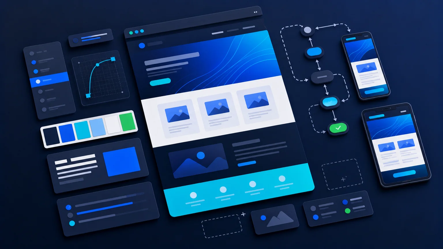
The design phase turns the website plan into a visual system that feels credible, easy to use and focused on enquiries. This guide explains the phase in practical terms for businesses that want their website project to stay focused on visibility, credibility and enquiries.
Design is where structure becomes a clear user experience, with hierarchy, spacing, visual style and calls to action working together.
Design Should Support The Message
Good web design is not decoration placed on top of content. It should make the message easier to understand. The layout, typography, spacing, colours, imagery and buttons should help visitors see what matters and move through the page without effort.
For service-led companies, design needs to create trust quickly. Visitors should be able to understand the offer, see relevant services, recognise the next step and feel confident that the business is active and professional. A website can look modern while still being practical and calm.
Create A Clear Visual Hierarchy
Hierarchy is one of the most important parts of design. The main heading needs to stand out. Supporting copy should be readable. Service cards should be easy to scan. Calls to action should be visible without overwhelming the page. If every element competes for attention, the page becomes harder to use.
This is why the design phase should include decisions about heading sizes, section spacing, card styles, buttons, forms and mobile layouts. Those details create consistency across the site, especially when future pages and guides are added.
Design Around Real Journeys
A design should account for different visitor routes. Some people arrive from Google and land on a service page. Some arrive from social media management activity and need quick context. Others already know the business and want contact details or proof. The design should support all of those journeys.
That means placing service links, proof, FAQs and contact routes where they naturally help the visitor. It also means avoiding sections that look impressive but do not help someone make a decision.
Make Responsive Design Part Of The Concept
Design should work on mobile, tablet and desktop from the start. It is not enough for a desktop layout to shrink at the end of the project. The mobile version needs its own spacing, readable content, simple navigation and buttons that are comfortable to tap.
The mobile responsive design guide explains this in more detail, but the principle is simple: the website should feel intentional on every screen, not like one version is the real site and the other is an afterthought.
Keep Search Engine Optimization And Accessibility In Mind
Design choices affect Search Engine Optimization and accessibility. Clear headings, readable contrast, descriptive links and sensible page structure all help users and search engines understand the website. A visually dramatic layout that hides important content can create problems later.
This is where design connects with search engine optimization friendly structure. The page should look credible, but it should also give important services and messages enough clarity to be found, understood and acted on.
What Kendall Digital Looks For
Kendall Digital approaches the design phase as a balance between brand, usability and commercial intent. The goal is not to chase trends. It is to create a site that feels modern, trustworthy and easy to use while still supporting enquiries.
A strong design gives the build phase a clear system to follow. It reduces guesswork, keeps the website consistent and gives future pages a visual framework that can grow with the business.
Common Design Mistakes To Avoid
A common design mistake is making the first screen visually loud but commercially thin. If visitors cannot quickly understand what the business does or where to go next, the design is not doing enough. Another mistake is using generic layouts that could belong to any company in any sector.
Design should also avoid hiding important contact routes. A website can be stylish and still make it easy to call, email, request a quote or start a conversation. The best design choices make those actions feel natural rather than bolted on at the end of a page.
How Design Helps The Rest Of The Project
A clear design system gives the build phase a reliable framework. Buttons, cards, forms, image treatments, FAQs, service sections and CTA bands can be turned into reusable components. This keeps the website consistent and makes it easier to add new pages later.
Design also helps content. Strong hierarchy gives copy the right rhythm, so important messages are not buried in long blocks. When design and content work together, the website feels easier to scan and more confident to use.
Questions Worth Answering In The Design Phase
Useful design questions include: what should visitors notice first, which proof points need to appear early, how should service routes be shown, where should contact options sit, what should repeat across pages, and how should mobile layouts prioritise content?
It is also worth asking whether the design supports future growth. A website will usually need new articles, landing pages or service pages after launch. The visual system should make that possible without every future page needing a bespoke redesign.
How To Review Design Decisions
Design feedback is most useful when it is tied to the visitor journey. Instead of asking whether a section is liked or disliked, ask whether it helps the visitor understand the service, trust the business and take the next step. This keeps feedback practical and reduces personal preference taking over the project.
Good design review should include desktop and mobile views. It should check whether headings are clear, buttons are easy to understand, service blocks are balanced and important content is not pushed too far down the page. The design should feel confident, but it should also make the site easier to use. This keeps the visual work tied to real outcomes rather than style for its own sake.